

How We're Looking at Market Breadth

Market breadth is a popular topic these days. In fact, it’s been a pretty popular topic for most of the past 12 months. But is breadth really as bad as everyone seems to think?
First of all, when we talk about breadth, we’re talking about how many stocks are participating in a trend. The more stocks moving the same direction, the stronger that trend is. Sure, a handful of large stocks can drive market cap-weighted index indexes higher all by themselves. Sometimes they can do it for a lot longer than people expect. But they can’t do it forever.
Monitoring stock market participation is a way to monitor the health and durability of a trend.
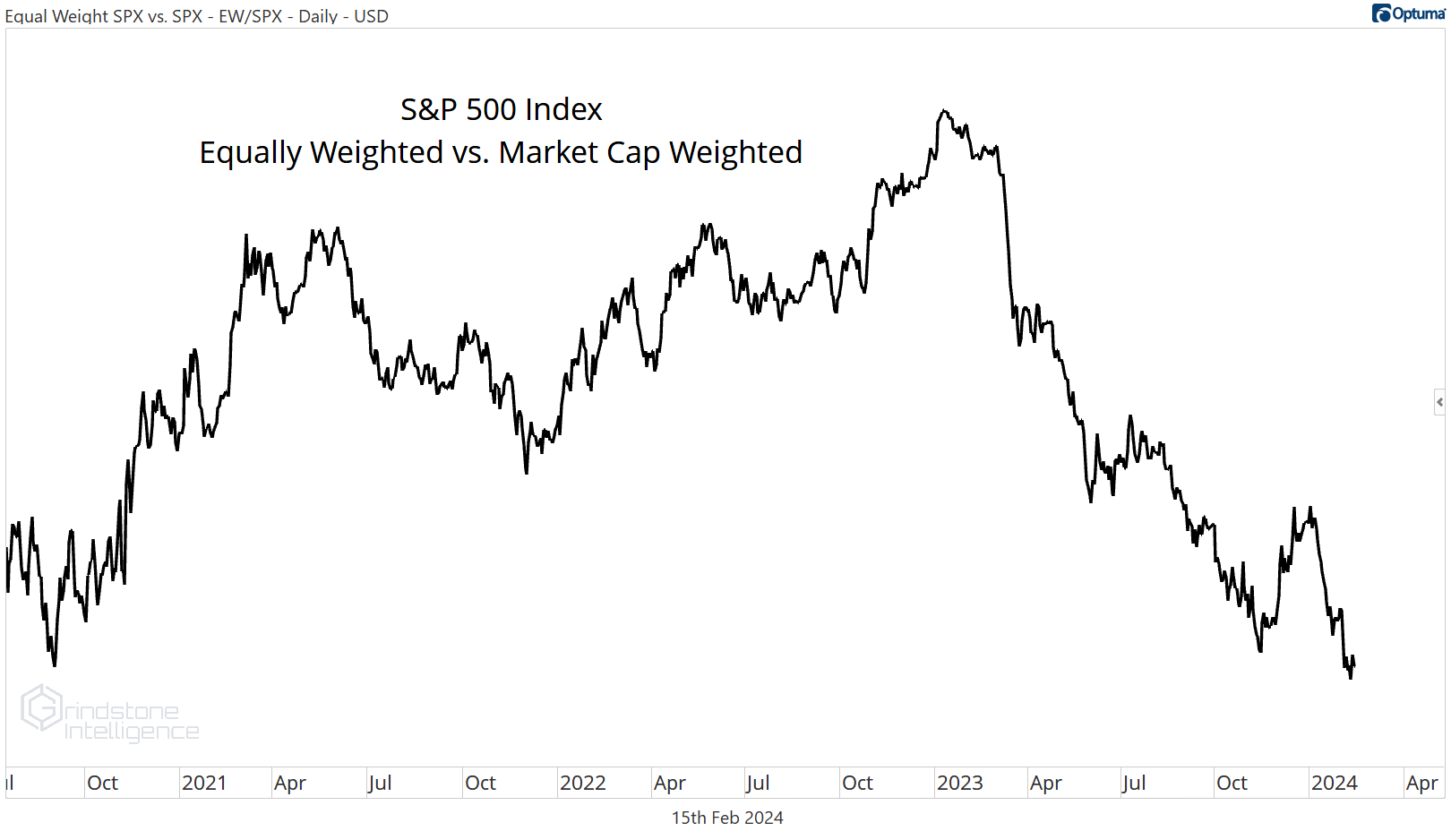
In 2023, everyone knows that handful of mega cap stocks drove the vast majority of market returns. Even my friends that don’t follow the market were telling me about how the S&P 500 was really just the S&P 7. That’s continued into 2024. The equally weighted S&P 500 - which strips away the outsized influence of the mega caps - just fell to 15-year lows relative to the cap weighted index.
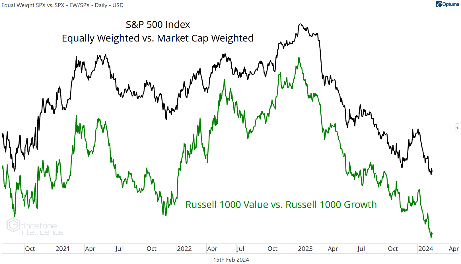
But just because the average stock is lagging doesn’t mean breadth is bad. It just means that certain types of stocks are rising more than others. In this case, it was growth stocks doing better than value stocks. Take the same line from above and compare it to the ratio of the Russell 1000 Growth index vs. the Russell 1000 Value index. They look exactly the same.
So when we look at breadth, we aren’t so much concerned with the magnitude of moves in each stock, but the direction. As long as the majority of stocks continue to move higher, we can be confident that underlying breadth remains healthy and the current bull market will continue.
Let’s dig into some of our favorite breadth measures.
Moving Averages
If the goal is to count uptrends and downtrends, one of the simplest ways to do it is with moving averages: a stock higher than its average price over the last month or year can be assumed to be trending higher, and vice versa.
Today, about two-thirds of large cap stocks are above their long-term moving average. Of course, that number oscillates from day-to-day and week-to-week, so data from a single point in time doesn’t tell us everything. What we find most interesting is where the peaks and troughs in those oscillations occur. And at the most recent peak, uptrend breadth was the strongest it had been since September 2021.
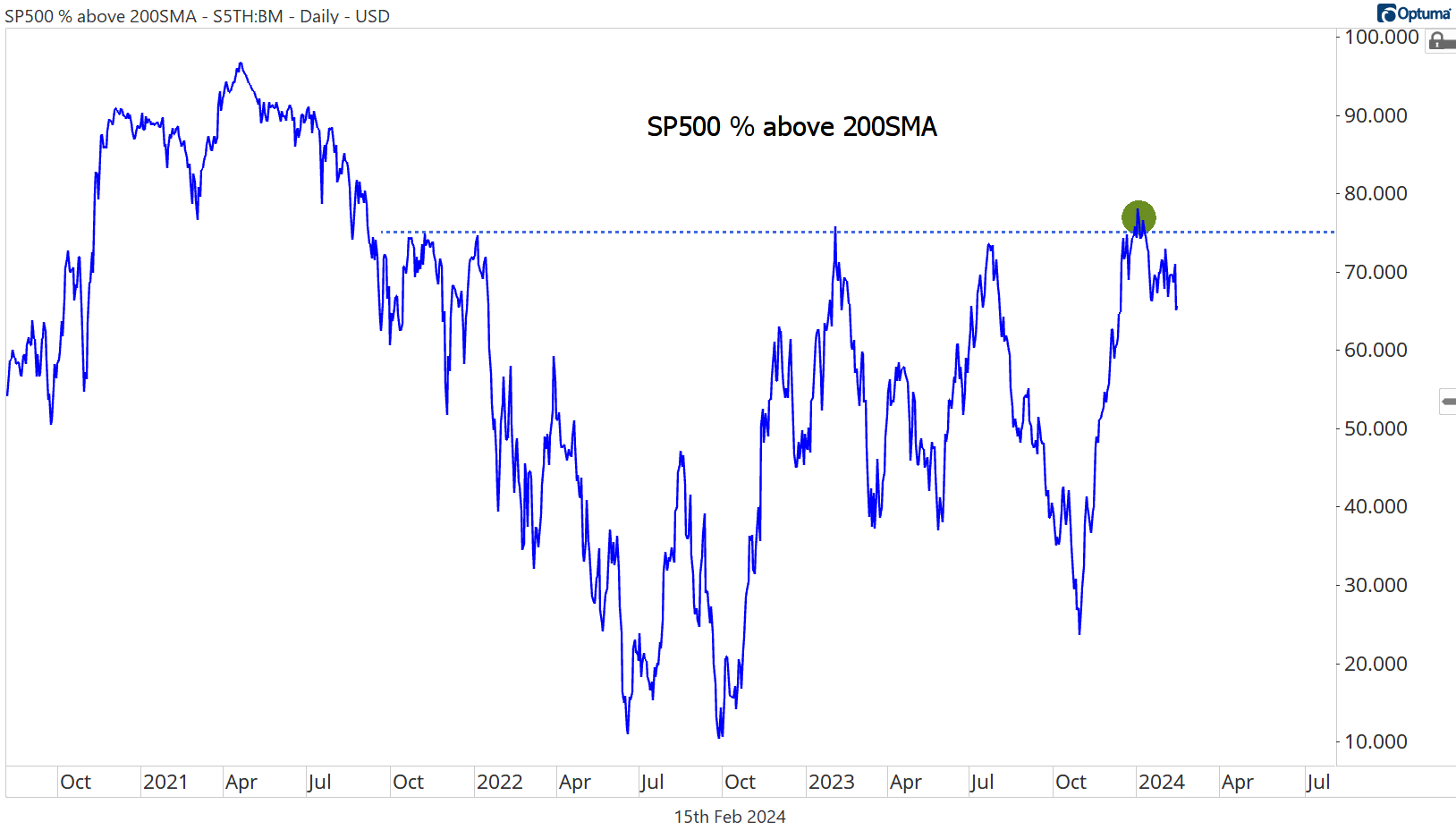
Of course, breadth was much stronger in early 2021, when more than 90% of S&P 500 stocks were above their 200-day. In order to repeat that feat, we’ll need to see some improvement from defensive areas of the market like Utilities and Consumer Staples. Unfortunately, those areas are also showing weakness on a short-term basis, when compared to their 50-day moving average.
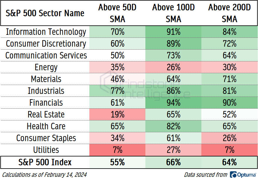
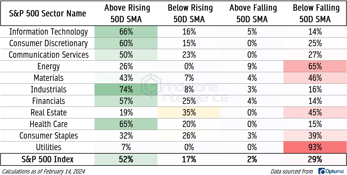
Comparing the current price to a moving average is fine, but we can take it one step further to glean even more information. A stock whose price is above a rising moving average cannot be in a downtrend. A stock whose price is below a falling moving average cannot be in an uptrend.
Adding this component only confirms the bifurcation in today’s market. In offensive sectors like Information Technology, Financials, and Industrials, 80% of stocks are above a rising 200-day moving average. They’re undeniably in long-term uptrends.
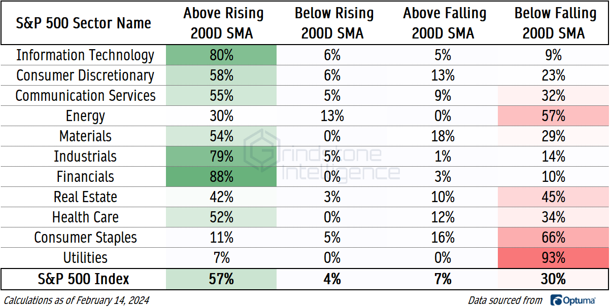
For Utilities and Consumer Staples - and also Energy and Real Estate - things aren’t so rosy. More than half of stocks in those sectors are in confirmed downtrends. And nearly every Utilities stock is.
On a shorter-term look, we largely have the same dynamics, which means big improvements to breadth will be hard to come by. But there are a few developments to take note of. Eighty percent of Real Estate stocks are below their 50-day, but just 45% are below a falling 50-day. That’s an indication that breadth isn’t quite as bad as it looks on the surface. The same goes for Consumer Staples, where a quarter of the sector is below a 50-day that’s still on the rise.
New Highs and New Lows
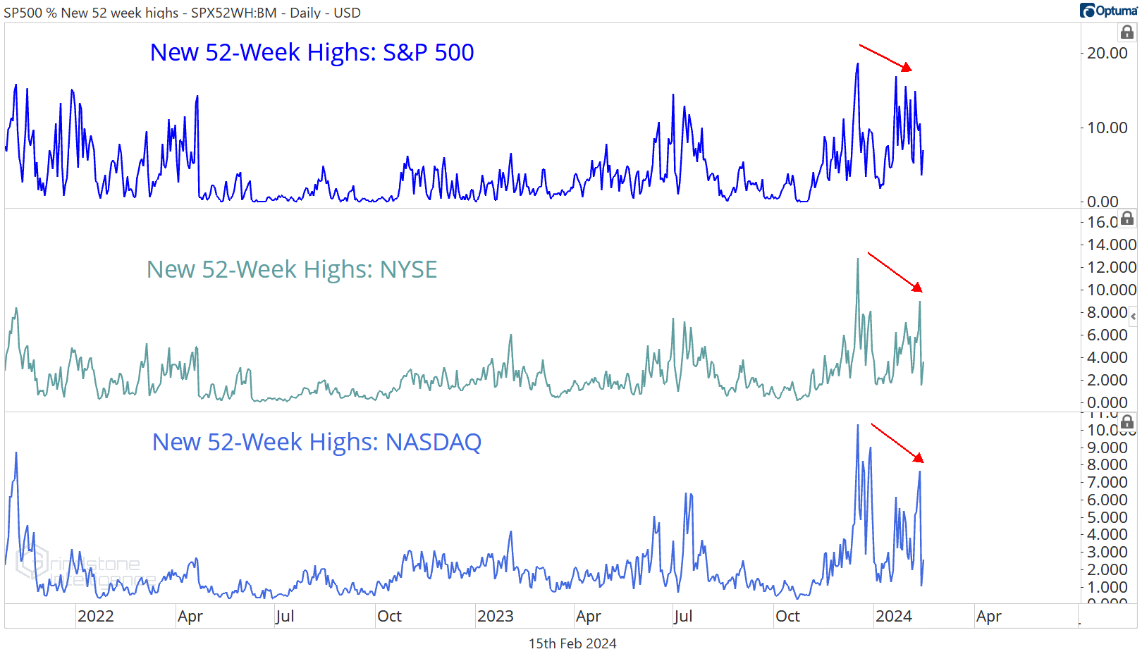
If a stock is rising, that stock will set new highs. If lots of stocks are rising, lots of stocks will set new highs.
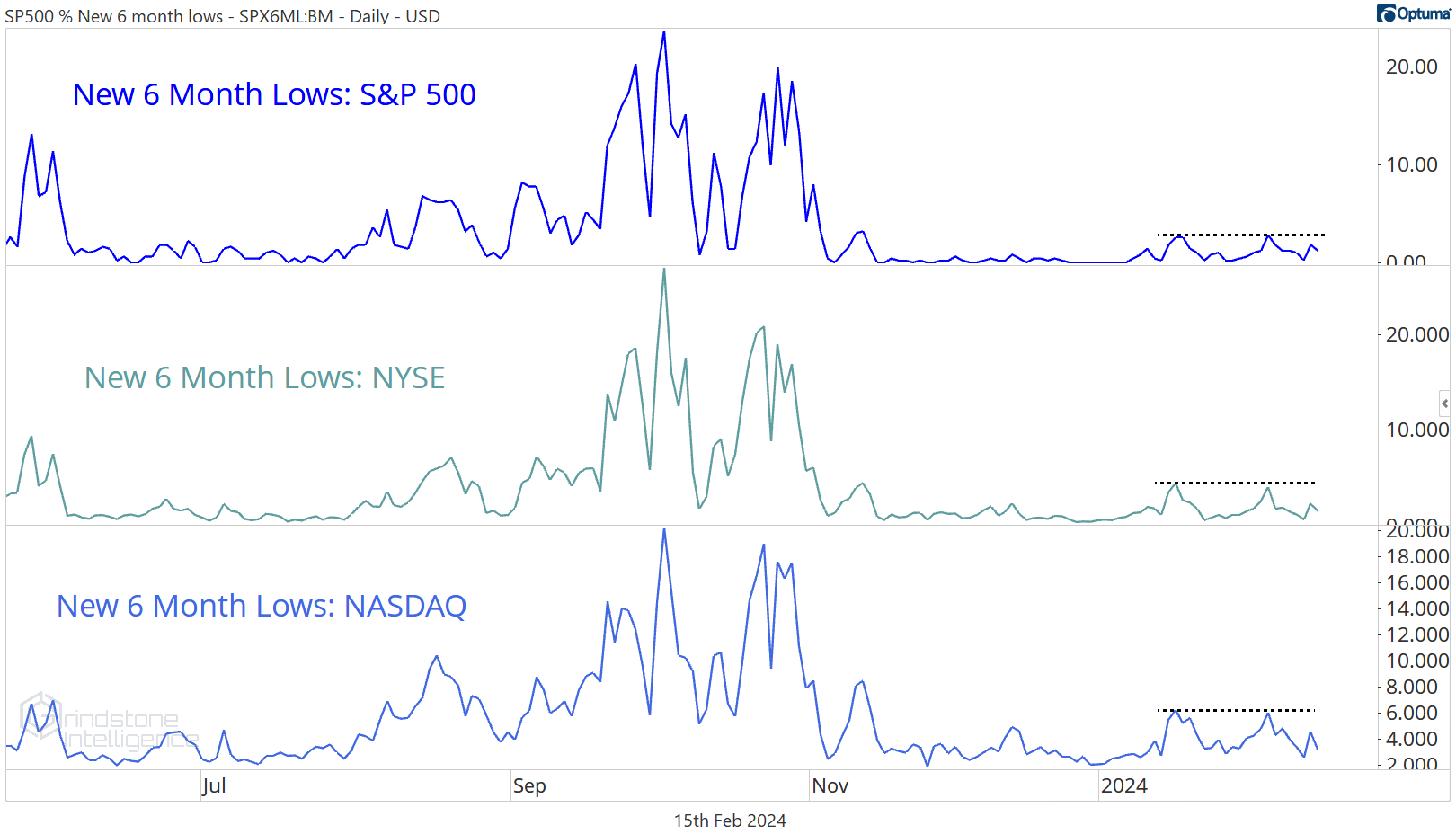
The S&P 500 just set a new all-time high earlier this week, but the list of stocks setting new highs - for not just the S&P 500, but also the NYSE and the NASDAQ, too - stopped growing in mid-December. That’s a concerning divergence to keep an eye on.
What would really be concerning is if we started to see an expansion in the number of new lows. A stalling out in the number of new highs might mean that an uptrend is slowing, but we can’t be talking about a new downtrend unless stocks start falling. Looking at the list of new 52-week lows, we saw the number tick up slightly for the S&P 500 in January, but we didn’t see confirmation from either the NYSE or the NASDAQ. The weight of the evidence suggests there’s nothing to be worried about.
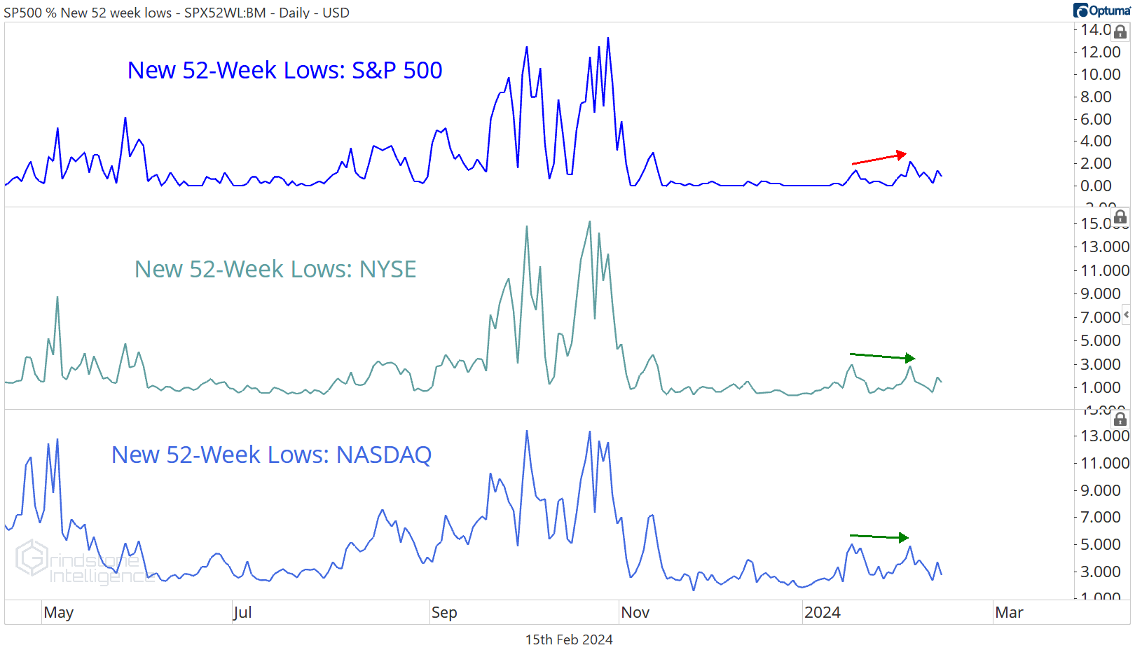
To be fair, though, we can’t expect to be seeing a bunch of new 52-week lows the same week that markets are setting new all-time highs. Stocks have to set new 6-month lows before they can set new 52-week lows. Fortunately, we aren’t seeing that either. The list of new lows for the S&P 500, NYSE, and NASDAQ hasn’t moved any higher for the past month.
On a shorter-term look, things are even stronger. We can look at whether a stock has more recently broken out or broken down and determine whether that stock is in a cycle of setting new highs or new lows. 81% of S&P 500 members are in a new 3-month high cycle. Only the Energy sector has fewer than half.
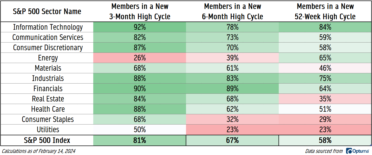
We’ll be more concerned when this dashboard starts to show more red than green.
Momentum
When stocks are rising, they tend to get overbought. When stocks are falling, they tend to get oversold.
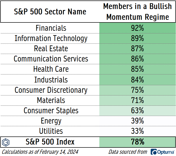
If we look at whether a stock’s 14-day RSI has eclipsed 70 or fallen below 30 more recently, we get another assessment of whether the buyers or sellers are in control of a stock. 78% of S&P 500 stocks are in a bullish momentum regime, unsurprisingly led by offensive sectors like Financials and Information Technology. The standout here is Real Estate, though, which came in near the bottom of the list when we assessed moving averages, yet has 87% of its members getting overbought. The sellers are not in control.
The Averages
The cumulative advance-decline line might be the most well-known breadth indicator out there. Its calculation is fairly simple: an index is created by cumulatively adding or subtracting the net of rising vs. falling issues for each trading day. If a greater number of stocks are rising than falling, the advance-decline line rises, and vice versa. No indicator is infallible, but the NYSE Advance-Decline line has diverged from prices before several major stock market selloffs.
That’s not what’s happening today. The NYSE A/D line just hit a new 52-week high on Monday.
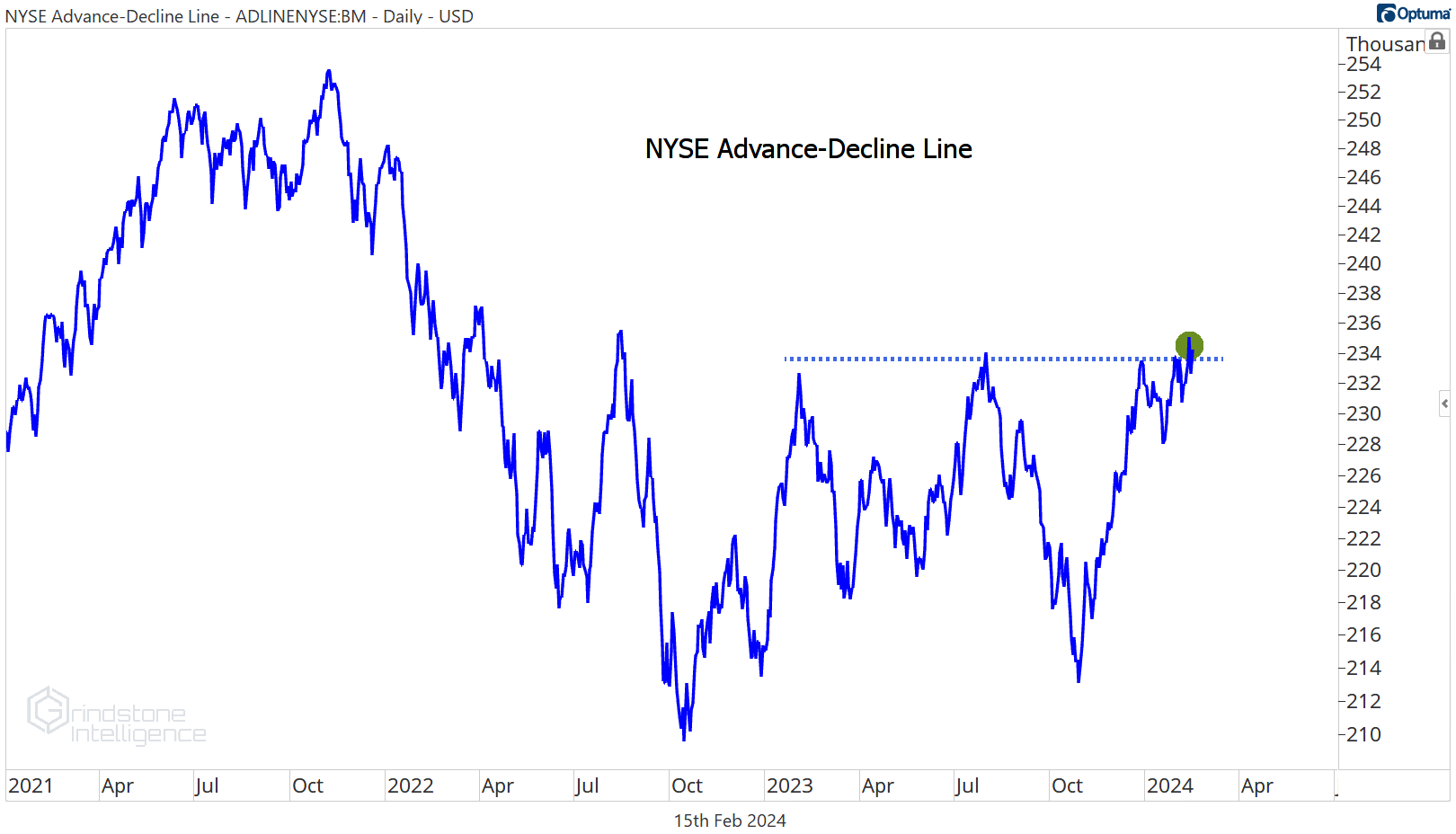
If anything, the A/D line is confirming the rise in stock prices. It’s certainly not sending us a bearish signal here.
Where we’re still waiting on confirmation of the bull move is in the Value Line Geometric Index. This index is designed to track the median change in stock price, and it says the median stock is still stuck in an 18-month trading range.
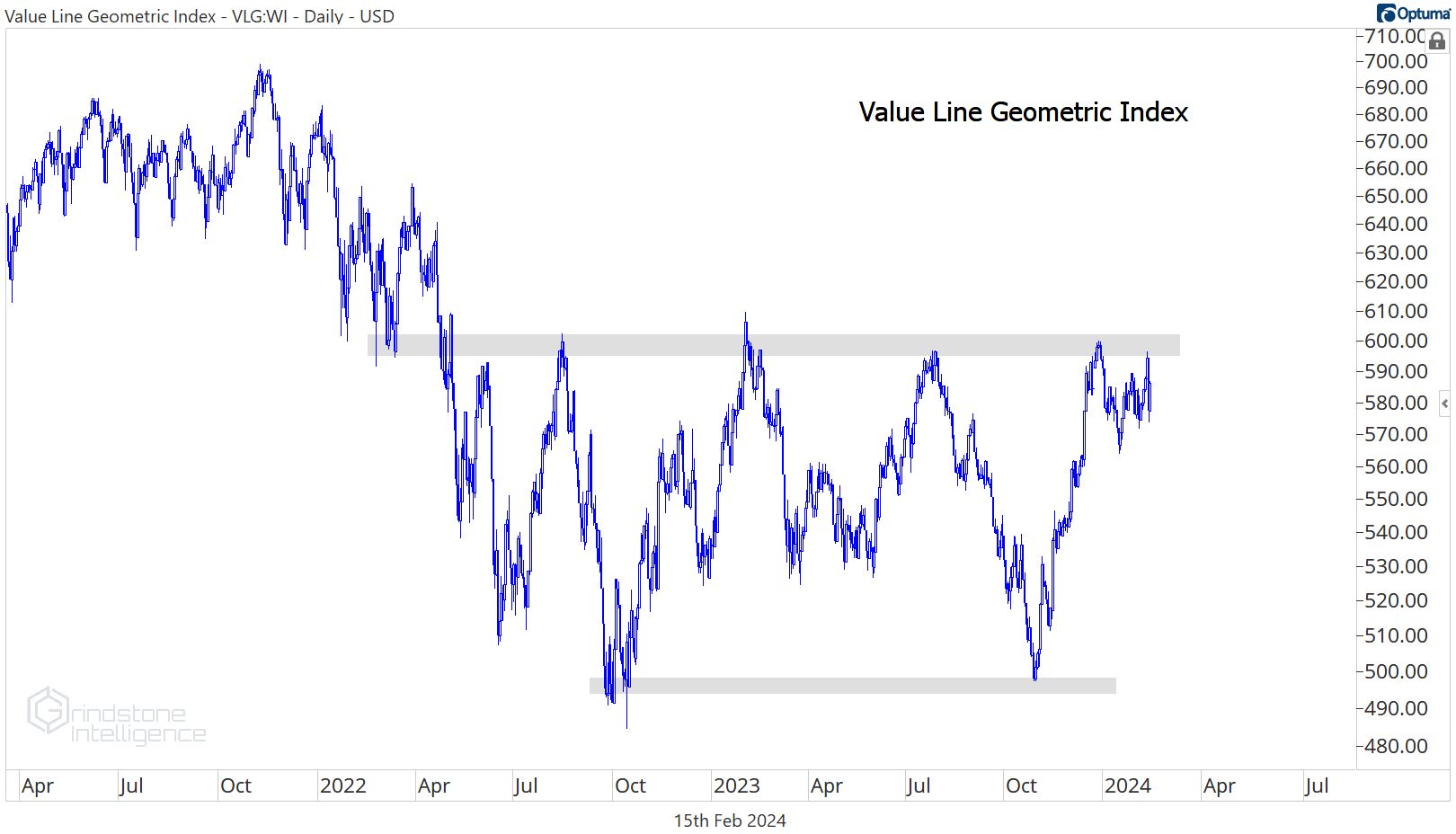
That’s not bearish - but it’s not bullish either. In our continuing bull market checklist, we’d like to cross off ‘Breakout in the Value Line Geometric Index’ next.
Until next time.