

Is Breadth Pointing Towards a Bear Market?

We’re in the midst of the steepest market selloff of the year. The S&P 500 peaked back on March 28th, and has since fallen more than 5% from those highs. The big question is, was that the top, or just a top?
Today we’ll run through our favorite breadth metrics to help us sort out what’s going on beneath the surface.
When we talk about breadth, we’re talking about how many stocks are participating in a trend. The more stocks moving the same direction, the stronger that trend is. Sure, a handful of large stocks can drive market cap-weighted indexes higher all by themselves. Sometimes they can do it for a lot longer than people expect. But they can’t do it forever.
Monitoring stock market participation is a way to monitor the health and durability of a trend.
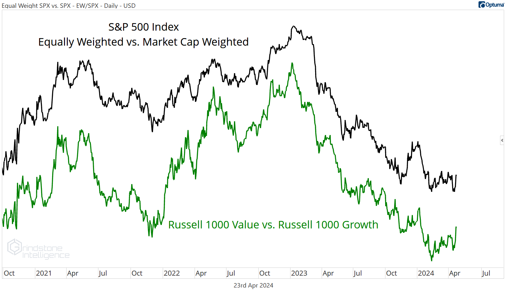
In 2023, everyone knows that handful of mega cap stocks drove the vast majority of market returns. Even my friends that don’t really follow the market were telling me about how the S&P 500 was really just the S&P 7. They weren’t far off - the average stock lagged the S&P 500 return by the most since 1999 last year.
But just because the average stock is lagging the return of the market cap weighted index doesn’t mean breadth is bad. It just means that certain types of stocks are doing better than others. In this case, it was growth stocks rising faster than value stocks. Take the ratio of the equally weighted S&P 500 vs. the market cap weighted index and compare it to the ratio of the Russell 1000 Growth index vs. the Russell 1000 Value index. They look exactly the same. This chart is a leadership story, not a breadth story.
So when we look at breadth, we aren’t so much concerned with the magnitude of moves in each stock, but the direction. As long as the majority of stocks continue to move higher, we can be confident that underlying breadth remains healthy and the current bull market will continue.
And for now, that’s still what we’re seeing. Short-term trends have undoubtedly weakened, but the longer-term structure is still intact.
If the goal is to count uptrends and downtrends, one of the simplest ways to do it is with moving averages: a stock higher than its average price over the last month or year can be assumed to be trending higher, and vice versa.
Today, more than two-thirds of large cap stocks are above their long-term moving average. That’s below the year-to-date high of 82%, but still a reading consistent with uptrends of the past, and in-line with the high end of last year’s bull market action.

Comparing the current price to a moving average is fine, but we can take it one step further to glean even more information. A stock whose price is above a rising moving average cannot be in a downtrend. A stock whose price is below a falling moving average cannot be in an uptrend.
Adding this component confirms that for the majority of stocks, this bull market lives on. In every single offensive sector, including both growth-oriented (Information Technology, Consumer Discretionary, and Communication Services) and value-oriented (Financials, Industrials, Materials, and Energy) ones, at least half of stocks are above a rising 200-day moving average. They’re undeniably in long-term uptrends. Even in the weaker sectors, we’re seeing a more balanced view as opposed outright bearish characteristics. Only Real Estate (which comprises less than 3% of the S&P 500 index) has more constituents below a falling 200-day than above a rising one.

This is where the market’s troubles are more apparent. Check out the moving average breadth dashboard on a 50-day basis - there’s less green and more red in this table:
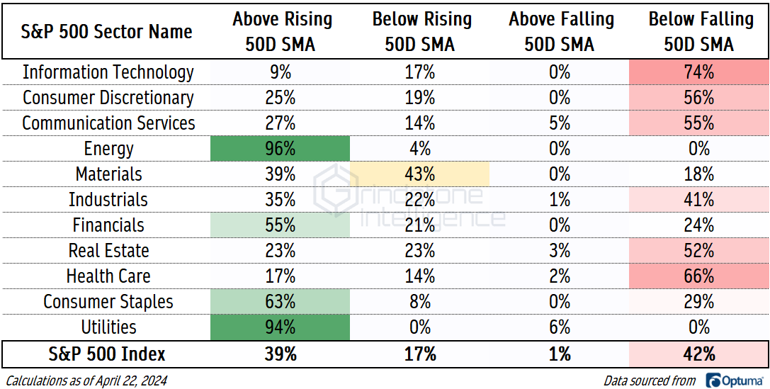
Again, though, we’re not yet seeing outright bearish characteristics across the board. Five of the 11 sectors still have more stocks in short-term uptrends than they do in short-term downtrends. There’s nothing fun about stock market selloffs, but it’ll take more than what we’ve gotten so far to put an end to this bull market.
New Highs and New Lows
If a stock is rising, that stock will set new highs. If lots of stocks are rising, lots of stocks will set new highs. If lots of stocks are falling, lots of stocks will set new lows. If that seems too simple, that means we’re doing something right. Keeping it simple is a good thing.
Last week, we talked about the failed breakouts that fueled this market decline:
Selloffs sparked by failed breakouts are mean reversions until they’ve proven otherwise.
But all new bear markets have to start somewhere.
If we could only watch one thing to tell us that this mean reversion was turning into an outright trend reversal, it would be the list of new lows. You can’t have a bear market without an expansion of that list.
The list of new 52-week lows are setting new year-to-date highs. We shouldn’t ignore that, but we also need to add some context - the number of new lows is still short of levels we saw throughout 2023:

Another way to monitor ‘breakout breadth’ is by looking at the difference between the number of new highs and new lows - a ‘net’ new highs index. We also like throwing a short-term moving average on that net to smooth out the day-to-day action and help us identify the underlying direction.
It’s been in positive territory all year.

But wait, is it really fair to be looking for new 52-week lows when the market is just a few weeks removed from all-time highs? Maybe not. We’ll see an expansion in the number of new short-term lows before we see a bunch of new 1-year lows. Fortunately, the story is the same even on a short-term basis.
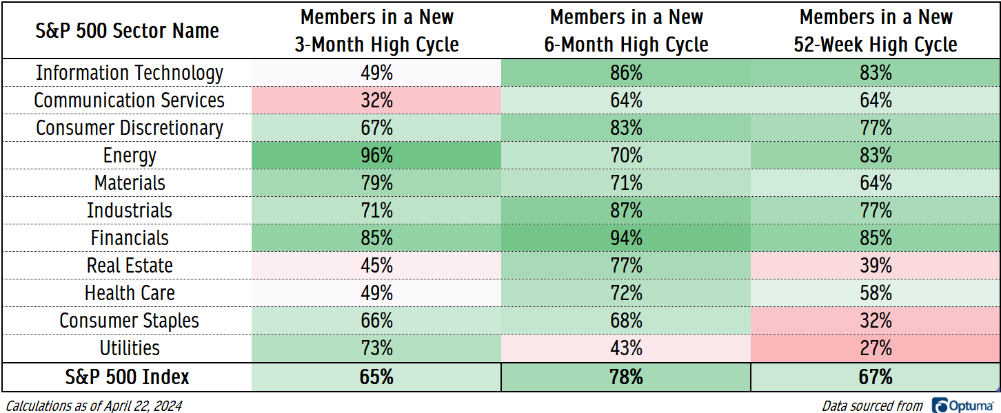
We can look at whether a stock has more recently broken out or broken down and determine whether that stock is in a cycle of setting new highs or new lows. Two-thirds of S&P 500 members are in a new 3-month high cycle.
We’ll be more concerned when this dashboard starts to show more red than green.
Momentum
What about momentum? When stocks are rising, they tend to get overbought. When stocks are falling, they tend to get oversold.
If we look at whether a stock’s 14-day RSI has eclipsed 70 or fallen below 30 more recently, we get another assessment of whether the buyers or sellers are in control of a stock. Once again, the sellers have yet to really seize control. The Utilities sector is the weakest area in the market with just 40% of its members in an overbought momentum regime - and that sector traded at a new 26-week high yesterday.

The Averages
The cumulative advance-decline line might be the most well-known breadth indicator out there. Its calculation is fairly simple: an index is created by cumulatively adding or subtracting the net of rising vs. falling issues for each trading day. If a greater number of stocks are rising than falling, the advance-decline line rises, and vice versa. No indicator is infallible, but the NYSE Advance-Decline line has diverged from prices before several major stock market selloffs.
That’s not what’s happening today. Just a few weeks ago, the NYSE A/D line finally surpassed the highs it set at the end of the prior bull market. If anything, the A/D line was just confirming the bull market in stock prices.

Some of you might look at the chart above and worry about the failed breakout. We aren’t fans of applying traditional pattern recognition on an advance-decline line - it’s just a little too far removed from something that’s actually being traded for our taste.
This failed move in the Value Line Geometric Index is more interesting. This index is designed to track the median change in stock price, so it gives us a great feel for the ‘average’ stock.
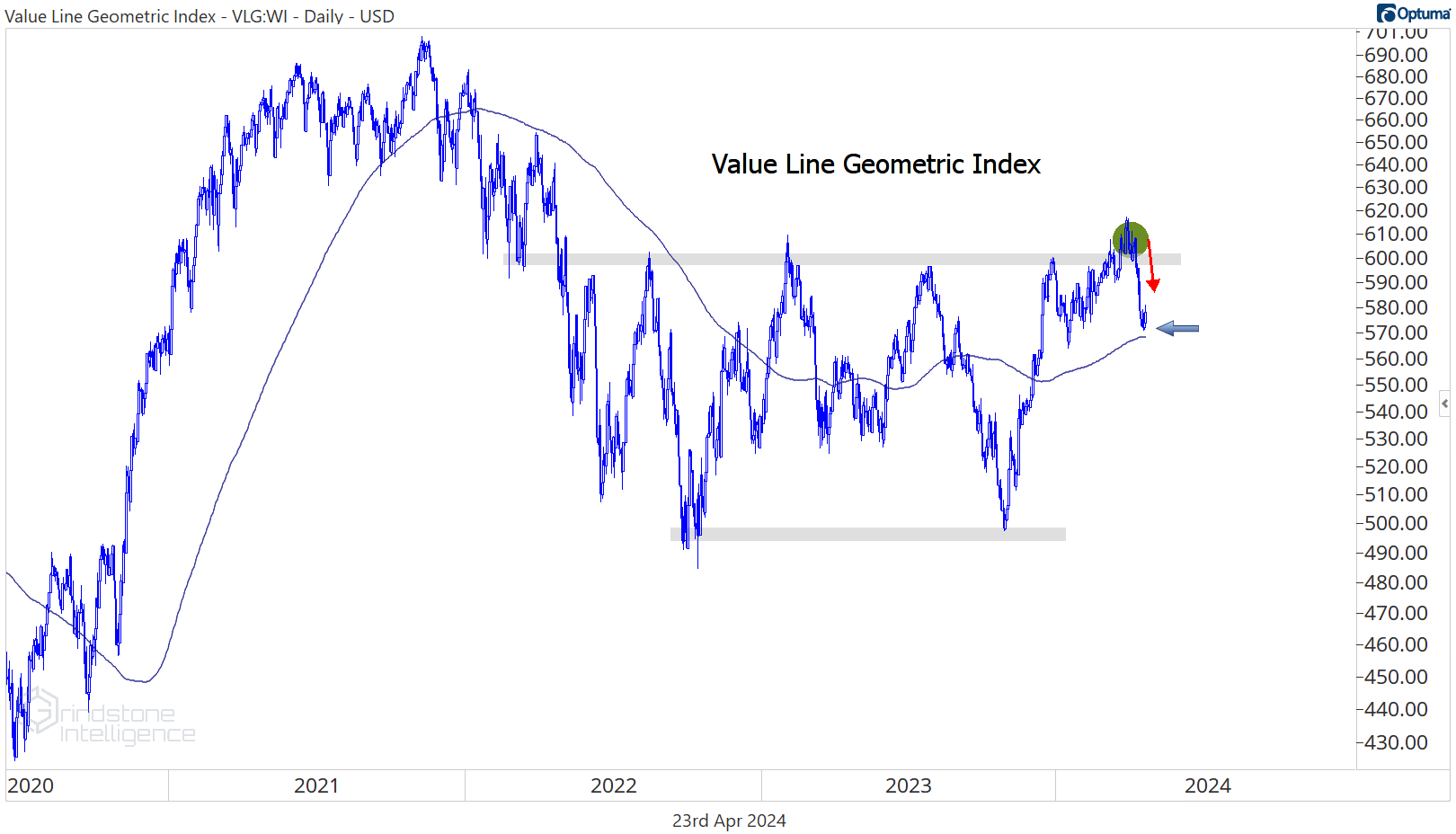
Failed breakouts are mean reversions until proven otherwise, and the Value Line Geometric Index is already back to its 200-day moving average. Now it’s time to see whether bears can push stocks below their mean.
That’s all for today. Until next time.